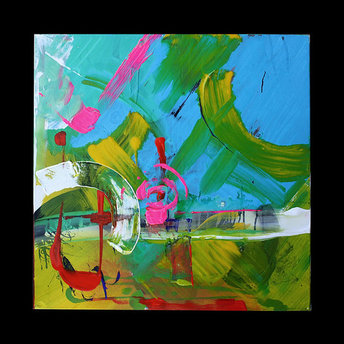
Of the four made so far in this series, this is a departure in terms of colour palette from the others, but you will still find pink and traces of dark purple - yum!
I was thinking about the colours of a macaw or parrot as I began this.
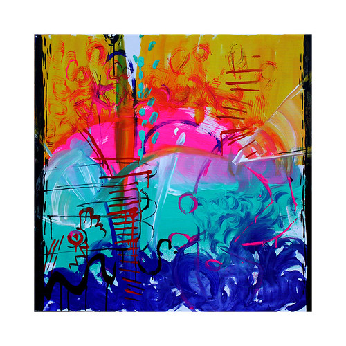
Thursday 27 January 2011
wild bloom, breeze. Acrylic and ink on canvas. 23.5" x 23.5"
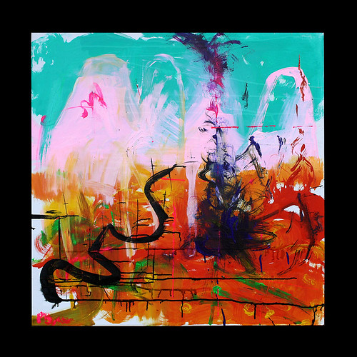
Lava Pool. Acrylic and ink on canvas. 23.5" x 23.5"
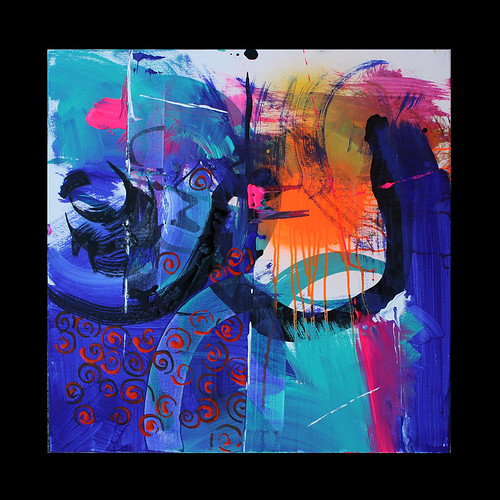
Another of the four "Jungles" pieces I have finished today.
Witchdoctor. Acrylic and ink on canvas. 23.5" x 23.5"
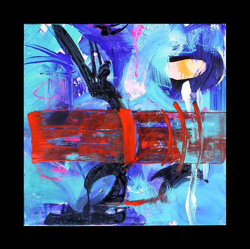
I had a lot of fun working up this piece. The underpainting was actually another painting I had been working on but that had reached a crossroads......this morning I thought I would take a risk and simply repaint over it. The "Jungles" theme was in the back of my head I guess and this piece was the result.
In my character illustration I am fond of B-movie type scenarios - exotic jungles, mysterious trails, adventurers, evil high priests etc.....in movies where these types of tropes are prevalent, the use of chiaroscuro in the style of lighting is always a wonderful, basic value.The contrasting colours and tones reflect my fondness of this, but the raw non-figurative gestures are different from my polished and clean illustration work....the common links are the traces of drawing style in the shapes. And of course the colour palette...
Forest Dawn.Acrylic, ink, canvas. 35" x 35". 1.5" deep.

This week the work started going in fresh directions. My use of white space is at an end for the moment as I start to fill the whole canvas with colour.
The blacks were the last element to be added.
I am pleased because without really thinking about it I have returned to a favourite theme of mine - that of exotic jungles, forests and the play of light through trees and foliage.
The colour palette is similar to character illustrations I have done in the last year too. I always seem to end up using "edible" colours!
This painting is part of a set I have started called "Jungles" as a loose theme. Colour is the driving force behind these pieces and the gestures and various marks I use direct the colour in different ways. Each piece has a different feeling as a result and I hope they will ellicit strong feelings in those who view them. It is really all I want from this work.
Tuesday 25 January 2011
Barracuda. Acrylic and ink on canvas. 36" x 36". 1,5" deep.
I am very happy about the way the blacks work in this ecstatic piece! The joyful, zinging colour palette singing (shouting!) off the more passive blacks.
Its one of my favourite pieces, which, once again, I was really doubtful about right till the last stage.....
Cataclysm in Azeroth. Acrylic and ink on canvas. 36" x 36". 1.5" deep.
Those of you who know me will appreciate the massive geek factor: I am a bit of a gamer......that said, its only in the last few weeks that I have really gotten into World of Warcraft!
The RGB palettes of Blizzard's wonderful virtual world contain colours that really do glow!
The latest expansion and update centres around the cataclysm as Azeroth's landscape is ravaged somewhat by a large and nasty dragon.
Here is my response! I have not worked to such a literal theme for a while, but was itching to pay "tribute" to the beautiful visuals on show in the game. The colours and lighting really add amazing atmosphere to adventuring here.
Monday 24 January 2011
Arrival Arcs. Diptych. Acrylic, ink on canvas. 23.5" x 47"
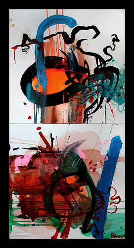
Finished this piece this morning and am feeling really happy: both these canvasses were pieces that to a greater or lesser extent felt unresolved.
This morning, after a break from painting over the weekend, I climbed the ladder into the attic and saw them both afresh.....and together.
Thursday 20 January 2011
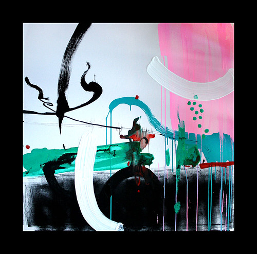
Untitled. Acrylic and ink on canvas. 30" x 30"
Latest one for the exhibition. I finished this a couple of hours ago.
The attic is getting rather crowded now and I have three canvasses so far that I class as "fails". Not EPIC fails, but nonetheless, they are all instances where I lost control and direction. Interestingly, they all have the same thing in common: a loss of tension and direction between forms and lines for the eye to follow (or make up its own pathways).
There is little white space and a preponderance of muddy brown....that muddy brown that occurs when an artist loses direction and control of colours in their work. its like drowning visually....
Wednesday 19 January 2011
Zoom! Acrylic and ink on canvas. 30x 30"
Painted this one today. It was one of those pieces that, nearing the end, I couldn't sit well with. I went off and did something else and this afternoon had a feeling that if I looked again, it would come together...
Really pleased with the result and can't wait to see it hung at the exhibition.
I am finding as I work at an increased pace that more and more I am drawn to white space as a major part of my present work. The large canvas with the blue background I have started (see below in earlier posts) is not coming together at all at the moment. It seems too crowded and heavy. I haven't given up on it, but as yet can't work out an agreeable way to break up the space I have filled.....
Tuesday 18 January 2011
crocodile. Acrylic and ink. 40" x 40" canvas.
Finished today, this is the biggest canvas I have produced so far.
I began with the black ink along the bottom and the piece grew from there. The space available on the large canvas really affected my approach here and I found I was not afraid to "force" a result.
The title came about once I started adding the vermillion accents, which, although very small, really stand out against the green and pale turquoise, like blood or glinting eyes! Then the whole thing became a poem called "crocodile".
Thursday 13 January 2011
solo show coming up
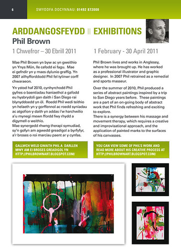
The brochure for upcoming exhibitions at Venue Cymru has been printed. In a nice touch, the guy who laid out the design is an ex student of mine from back when I ran a graphic design diploma at Coleg Menai. It is great to know that he is doing well running his own company now!
Today's progress
Started early this morning and now have four new pieces on the go.....although 2 might become one. They are the two smaller canvasses that I am aiming to use the palette I used on the commissioned pieces. For me, there are some legs left yet in the turqouise, vermillion and black combinations that came out of the client work.

The other 2 pieces are the largest canvasses that I have worked on yet. 40 x 40 inches and I love the sense of freedom and thus the extra boldness it gives me in making marks.
The bluey/turquoise piece is at a sort of underpainting stage. The process I am using here differs from the client work just finished and the smaller canvasses above in that I am waiting for each thin layer of acrylic and water to dry before applying another. This is slowly building up the "curtain" of texture I want, then I am already imagining the lines and forms I want appearing through and on top of this area.

The second larger piece has started in a really exciting way, the space available has really given me some new inspiration and I took the initial idea of using black printing ink rolled onto the canvas from a small cropped section of some images I created in the summer and then cut up.

Cropping images that I have created but that didn't meet the grade for me is a great way of finding new possibilities for comps.
This second large canvas is going to be all about establishing contrasts and allowing colour,form and line to sing against each other.
All the pieces will probably at present continue to hold themes of fauna, flower, moisture, rain for me.

The other 2 pieces are the largest canvasses that I have worked on yet. 40 x 40 inches and I love the sense of freedom and thus the extra boldness it gives me in making marks.
The bluey/turquoise piece is at a sort of underpainting stage. The process I am using here differs from the client work just finished and the smaller canvasses above in that I am waiting for each thin layer of acrylic and water to dry before applying another. This is slowly building up the "curtain" of texture I want, then I am already imagining the lines and forms I want appearing through and on top of this area.
The second larger piece has started in a really exciting way, the space available has really given me some new inspiration and I took the initial idea of using black printing ink rolled onto the canvas from a small cropped section of some images I created in the summer and then cut up.

Cropping images that I have created but that didn't meet the grade for me is a great way of finding new possibilities for comps.
This second large canvas is going to be all about establishing contrasts and allowing colour,form and line to sing against each other.
All the pieces will probably at present continue to hold themes of fauna, flower, moisture, rain for me.
Wednesday 12 January 2011
Acrylic and ink on canvas. 62 x 30"
This is my personal favourite of the 2. I left them untitled, but if someone forced me to give it a name, I would call it Falling Bloom.
Acrylic and ink on canvas 62 x 30"
Well, the 2 commissioned pieces are FINISHED! I am so happy as the client really loves them. It is such a satisfying feeling to think that these are going to a person who values them in a less commercial manner than my illustration work perhaps.
I can't wait to see photos of them in the yoga room my client had them commissioned for.
The design of these pieces is a process I am particularly happy with. Letting each canvas develop both on its own and then in comparisons and juxtapositions with the other three. It really made the whole process not just about putting paint down, but about framing, re-framing, re-connecting from different viewpoints and contexts and just letting the work form more freely than if I had simply set out to paint one at a time.
Now I am really fired up for the next pieces and the exhibition at the end of the month!
Just wish it would stop raining!
Tuesday 11 January 2011
Progress on new work
The first day went really well. I am impatient for results but find that if I work in short bursts and then leave things to "settle" for a bit, I return with fresh eyes and see things that I didn't half an hour back!
I have started juxtaposing the four pieces I have on the go, to see what tensions and dynamics occur. I find it a challenge to remain fluid and impartial - each time I repair or reposition the pieces, new possibilities appear. I am finding it a wonderful way to work - there is a design process here as well as a purely visceral application of paint.
I am making changes to the composition in response to the juxtapositions I am seeing. This means that where one canvas seemed strong as a standalone piece, adding a gesture or mark in response to the content of its close neighbour takes it to a new place visually. As I move the pieces around, repositioning and arranging, its easy to add new elements where it seems right.......indeed, just rotating a piece in relation to the others creates a whole new composition each time.
Theme - wise, things are staying consistent. Flower shapes and organic forms/lines once again dominate and I am pleased that the sense of playfulness from previous work is still present. The use of white space has a stronger role to play than in, say, the San Diego paintings and I like that alot. Letting the marks breathe on the canvas keeps the pieces developing in a light, happy manner. Me like!
I can see the final pairings for the 2 big client pieces taking time. I am also not sure whether attaching the pairs flush to each other is going to be necessary - I have been playing with placing them with a 3 inch gap between them.....they still work as unit but the gap really opens up space and possibility in the visual interface.......listen to me! You're really in trouble when you start using phrases like "visual interface"! Ha!
Will post results soon.
Monday 10 January 2011
First day back in the attic
Just begun work for the exhibition next month at Venue Cymru in Llandudno. I have roughly four weeks to produce pieces and getting back into the attic was hard! Now that I have five canvasses on the go things are feeling a bit more fluid. I have a loose theme or really a sense of the direction and palette these next pieces are going to take. In my mind I am seeing water, rain and flowers. I have set out to work quickly, which is the best way for me since then I don't get precious and the work remains animated and happy. Too much thought always leads to leaden results in my experience.
That said, I am keen to work using a more layered approach in some of the painting. Which means some patience on my part waiting for paint to dry before working on the top of previous marks.....this can be a loooong time when the previous layer is very liquid! I am armed with a hairdryer!!
I am also planning on establishing contrasts not only in the colour palette, form and line, but by adjusting the tempo of the application - I am already seeing the later stages of the pieces forming now being more careful and "tighter" or even tender paint marks. I think it will be exciting to make myself slow right down towards the later stages as a contrast to the quick, gestural and pretty physical marks I usually end up making.
Two of the pieces I am doing are for a client and we have agreed that they both be made up of two canvasses fixed together to create a bigger piece. This approach came about as a result of development experiments cropping and juxtaposing smaller pieces from separate paint sketches together. The sharp division created an interruption in the overall composition that was both discordant and exciting - it set the rest of the tensions in the pieces off wonderfully. I am really excited about making more paintings for the exhibition in this way.
I have posted some quick pics of the attic this afternoon - i am really running out of space up here with the boxes and bikes with these bigger canvasses but it is so freeing to work on a bigger scale. there seems to be alot more room for accidents and changes in direction within the spaces.
Subscribe to:
Posts (Atom)